The Journey of the User Interface
Cleb - August 25, 2015
User interfaces in video games are usually features people rarely care about until they dont like it, and then it can completely destroy a game. This means a surprising amount of time and thought went into creating the UI for CURE. In this post I will be mostly talking about the history of the visual design for the CURE user interface.
-In the Beginning
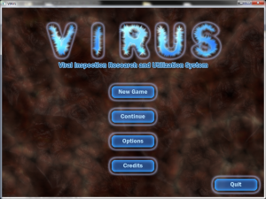
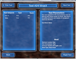
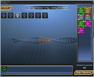
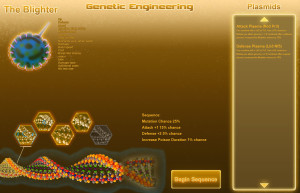
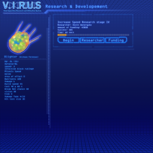
Designing and creating the user interface or UI for CURE has been a long and involved process. As some of you may know, we actually started this game a few years ago under the name VIRUS for a video game competition. At the time we were using an engine with very limited support for UI, so we had to get really creative with how we implemented our designs and displayed information to the player. Here are some of the designs from that old version:
As you can see it was very basic, but functional. I had wanted to give a sense of biology in the Menus, so I opted for a sort of light edge glow on all of the UI elements which matched what we were doing on the units.
-UI 2.0
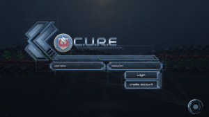
The next iteration of the UI relied heavily on the layout of the previous design of the in combat UI, but the opening menus was changed completely.
My goal then was the same as it is now create a UI that gives a sense of semi futuristic computer programs, but also keeping it restrained enough to be reasonable for a scientist to use. I went through several different design paths trying to find something that achieved all of these goals.
I landed on a grid patter background, that would raise and lower blocks based on where your mouse would move. The actual menu’s would load on top of the grid. I felt this design hit the futuristic look I was going for, while also being somewhat subtle.
-UI of the Future
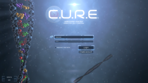
After months of looking at this design I discovered I really liked the idea of actually showing our in game graphics behind the Menus. It really captured my sense of imagination, and I hoped it would for our audience as well. However the menus I had built did not match this new concept at all, so I was back to the drawing board. This time I decided to really follow the futuristic computer concept all the way to the end. This led to a whole slew of new design theories.
I wanted the design to be futuristic, but still grounded. so I decided just about every element should have a purpose. It was difficult to not put strange graphs, numbers, and lines all over the place.
-Current Design
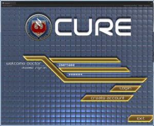
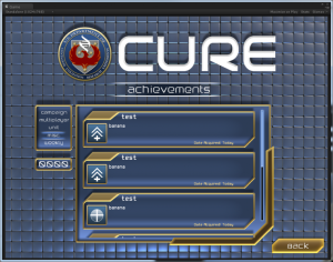
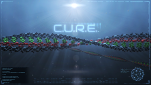
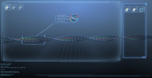
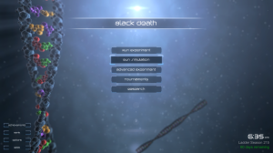
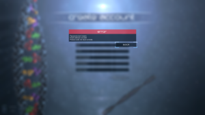
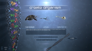
After a while the final design began to take shape, even though our layout was still undergoing changes as we updated game mechanics. The current design is simple and elegant, but still conveys a sense of a futuristic technology. CURE takes place in the near future, so I tried to keep the design principles similar to what we use today with just a little extra flare. Here are some screen shots of the UI as it works in the game right now
Thanks for reading and supporting us. Writing this post has really made me re-live the long journey the game has taken to get to the point where it is now. Its really fun to see the evolution of our graphics over the years. We have really enjoyed making CURE and with your support we can make it a great game that will be a genre definer.
Tweet
